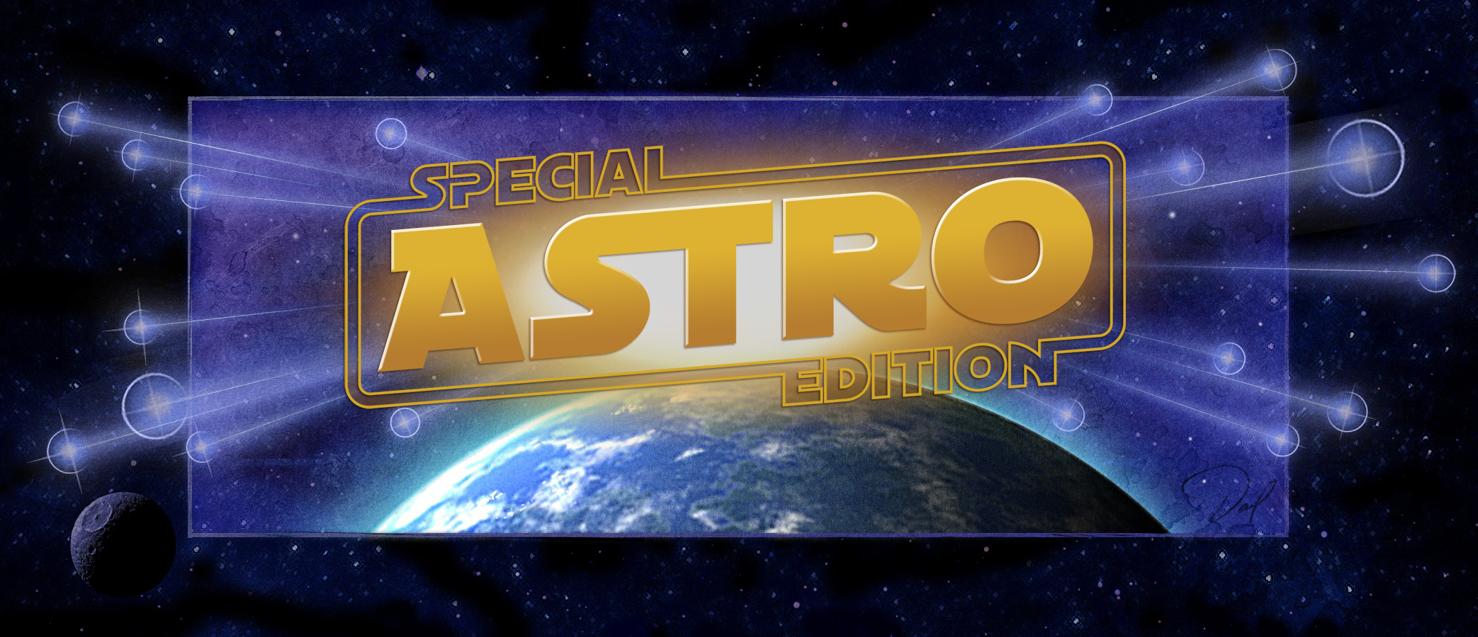
 |
 |

-
Astro SE 6/08
-
Kingdom 2.0 5/08
- World 2.0 5/08
- Iron Hero
5/08
- Time Travel
4/08
-
Galax-E
3/08

-
Safari
- Venture
- Galax-E
- Time Travel
- Astro SE
- Knight
- Iron
Hero
- Blade
- Aeronaut

-
Aeronaut
- Cinema

- Kingdom
- Mansion
- Encounter
- World

- Galax-E
- Encounter
- Time Travel
- Blade
- Voyager
- Astro

- School

- Forbidden Eye
- Aurebesh
- World Symbols

-
Font licenses
|
 |


ASTRO
gets its inspiration from one of the most popular space movies of all
time. Astro is a Star Wars font based on the Helvetica typeface. Some
letter combinations such as ST, LS, and ET result in connecting lines.
The Special Edition of Astro (version 5.0) takes into account the evolution
of this lettering style: capital letters feature the classic lettering
of the 1977, 1980 and 1983 films, and lowercase letters feature the
updated letterforms from the Star Wars Special Edition films in 1997/98.
The font also appears in the titles for the Clone Wars animated film.
This typeface is inspired by existing designs with additional characters
designed and digitized by David Occhino.
FEATURES
-
-
letters A-Z: Classic uppercase letters
-
letters a-z: Special Edition uppercase (variations in B C E J N
P R S W)
-
-
-
-
-
careful
spacing and kerning
-
Old
Republic symbol, Galactic Empire symbol (Mac only: sh-op-5 and 6)
-
alternate
letters (in Astro Alternate versions only): letters A-Z have Classic
uppercase letters with variations on the LEFT side of some characters;
letters a-z have Classic uppercase letters with variations on the
RIGHT side of some characters.
The
ASTRO font has been featured in many professional
publications, signs, posters and websites, including:
The
Star Wars Insider Magazine, Issue #37
The
Force.net website (Star Wars Fan Website)
ASTRO
is very different than the font known as "Star Vader.
Click
here to compare.
Members
of the Star Wars cast have purchased Astro font for their own use. |
PURCHASE
*
Please provide PayPal with a correct email address, as your font will
be sent to this address within 12 hours.
The message will be sent from “davidocchinodesign@mac.com;”
be sure that this address is not blocked and that you can receive
file attachments (zip files) with no issue. If you have any questions,
please send an email.
If
you would like additional information, please e-mail me at davidocchinodesign@mac.com.
COMPARE
Designers
of varying ability have created Star Wars style fonts, with different
degrees of success. With so many to choose from, it can be difficult
to decide which to use. I've created the following chart so that you
can learn why ASTRO SE is a better looking, professional-grade,
accurate representation of the Star Wars lettering that you need for
your font collection.
| |
Overall
Comparison with Astro SE
|
Character
Set* |
|
ASTRO
SE
by David Occhino
View Sample
|
Astro
is a font for professional designers and enthusiasts and those
who want a high-quality font. All glyphs are carefully formed.
Letter curves are optically perfect so that they can be used
even at large sizes. The font is based on both "classic"
and "special edition" styles. Many alternate glyph
styles are available in "Astro Alternate." A contour
style is included. Spacing and kerning is precise. Kerning allows
for proper connection of C, E, F, L, R, S, T and Z. An OpenType
format is available.
|
238
Astro
has the largest set of characters.
|
2008
Astro
was the first Star Wars style font on the web, first appearing
in 1996. |
STAR
VADER
by Anonymous
View
Sample |
A
large percentage of glyphs are poorly formed or are not in the intended
style. The font files have errors that cause font loading problems
and/or error messages. The font fails to install on many computer
systems. "Special edition" letter styles are not included. |
208
|
1997 |
JEDI
SOLID
by Neale Davidson
View
Sample |
Most
of the glyphs are too thin, resulting in a font that doesn't feature
the intended style. Some letters are not formed correctly. The
character set is basic. Special edition characters are not included. |
92
|
2000 |
SF
DISTANT
GALAXY
by
ShyFonts
View
Sample |
When
used at large point sizes (for posters, signs, large graphics) flaws
in the letter contours can be easily seen. Some punctuation, symbols
and accent marks are not drawn in the correct style. The character
set is not complete. |
183
|
1999
|
STAR
JEDI
by Boba Fonts
View Sample
|
Some
important glyphs (R, K, Q) are not properly formed, resulting
in the wrong look. Numerals 0-9 are in a completely different
font style. Important punctuation and symbols are missing. Accent
marks do not match the letters. Special edition characters are
not included. |
159
|
1998 |
RED
FIVE
by Fonthead Design
View
Sample
|
Because
this font is based on the "special edition" style, many
"classic" letters are not included. Several glyphs are
not formed correctly. Some punctuation and symbols are formed
incorrectly, or are missing from the character set. |
163
|
2008 |
A
NEW HOPE
by Greg Kegel
View
Sample |
Some
punctuation and symbols are formed incorrectly, or are missing
from the character set. Some important glyphs (R, K) are not properly
formed, resulting in the wrong look. The character set is missing
many key glyphs. |
125
|
1998 |
-
You
don't need these other fonts... these aren't the fonts you're
looking for.
Search your feelings... Purchase
ASTRO.
back
to top

|
 |