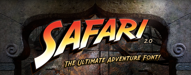
AFARI™ is the ultimate adventure font. Based on the famous movie logo created by Mike Salisbury and David Willardson, Safari conveys the bold hand-lettered titling of classic adventure films.
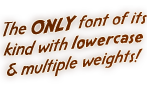
Designers will appreciate Safari's ten styles which allow for both text and display uses. First released in 1996, Safari™ was the first publicly available Indiana Jones font on the web and was updated in January 2011. Designed by David Occhino.
• Ten styles, including Solid, Outline and Shadow
• Complete character set
• Extended punctuation & international characters
• Three weights: Regular, Medium and Bold
• Small Caps for each style
• Free Indiana Jones™ Movie Titles Photoshop tutorial
* IMPORTANT: You must provide a valid e-mail address with your order. Our font software, in the form of a zip file attachment, will be e-mailed to this address. Delays in shipment may occur if your email account or server blocks our address (info@davidocchinodesign.com) or file attachments.