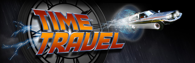
 |
 |

-
Astro SE 6/08
-
Kingdom 2.0 5/08
- World 2.0 5/08
- Iron Hero
5/08
- Time Travel
4/08
-
Galax-E
3/08

-
Safari
- Venture
- Galax-E
- Time Travel
- Astro
- Knight
- Iron
Hero
- Blade
- Aeronaut

-
Aeronaut
- Cinema

- Kingdom
- Mansion
- Encounter
- World

- Galax-E
- Encounter
- Time Travel
- Blade
- Voyager
- Astro

- School

- Forbidden Eye
- Aurebesh
- World Symbols

-
Font licenses
|
 |


PURCHASE
| FEATURES | COMPARE
Time
Travel is a sleek, precise Back to the Future font inspired
by the lettering from the movie posters for the 1985 blockbuster film
directed by Robert Zemekis. The font comes in six styles, including
a "Future" version that leans forward, and a "Back"
version that leans backward. It is the only Back to the Future font
that includes
lowercase letters and a complete
character set. This typeface was designed by David Occhino.
FEATURES
-
-
-
-
Special
characters and symbols
-
-
-
-
Careful
spacing and kerning
-
Comes
in six styles: Time Travel Forward, Forward Outline, Forward Shadow,
Back, Back Outline and Back Shadow
*
Please provide PayPal with a correct email address, as your font will
be sent to this address within 12 hours.
The message will be sent from “davidocchinodesign@mac.com;”
be sure that this address is not blocked and that you can receive
file attachments (zip files) with no issue. If you have any questions,
please send an email.
If
you would like additional information, please e-mail me at davidocchinodesign@mac.com.
COMPARE
- There
are three Back to the Future fonts on the web that try to convey this
style:

TIME
TRAVEL is a better looking, more complete representation of the
Back to the Future
movie lettering, and is the best Back to the Future font available on
the web.
| |
|
spacing,
kerning,
alignnment
|
|
TIME
TRAVEL
by David Occhino
View
Sample
|
Each
glyph in Time Travel is formed
accurately and consistently and true to the intended style. |
Spacing
and kerning create a tightly-fitting
set of glyphs that look right. |
A
great looking set of lowercase letters are included, as well as a
full
character set. |
DOUBLEBACK
by Comicraft
View
Sample |
Many
letters deviate
from the style. The font looks thicker overall than the intended style. |
The
width of the font is too
wide. Small gaps appear between some letters. |
None
available. |
BACK
to the FUTURE
by
Cyril B.
View
Sample |
Some
glyphs look good, but many need to be fixed because they either aren't
true to the style, or an edge needs adjustment because it is too
thick or too
thin. The numerals are not
refined. |
Spacing
and kerning need a lot of work. |
None
available. |

|
 |